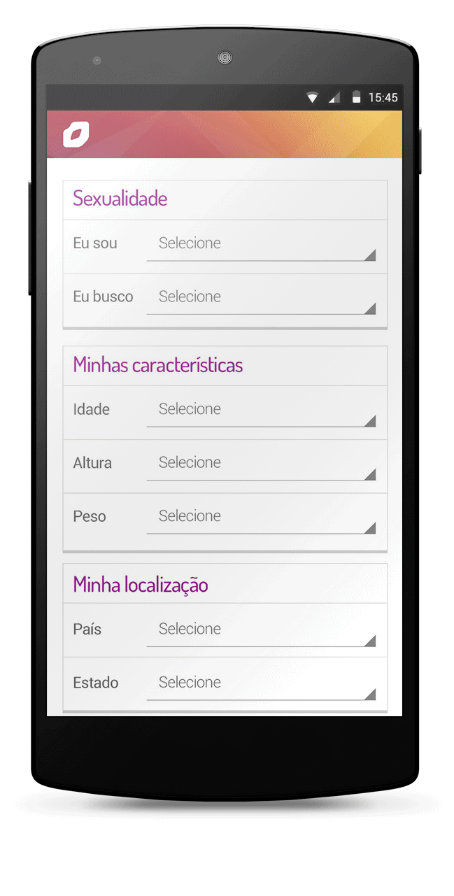
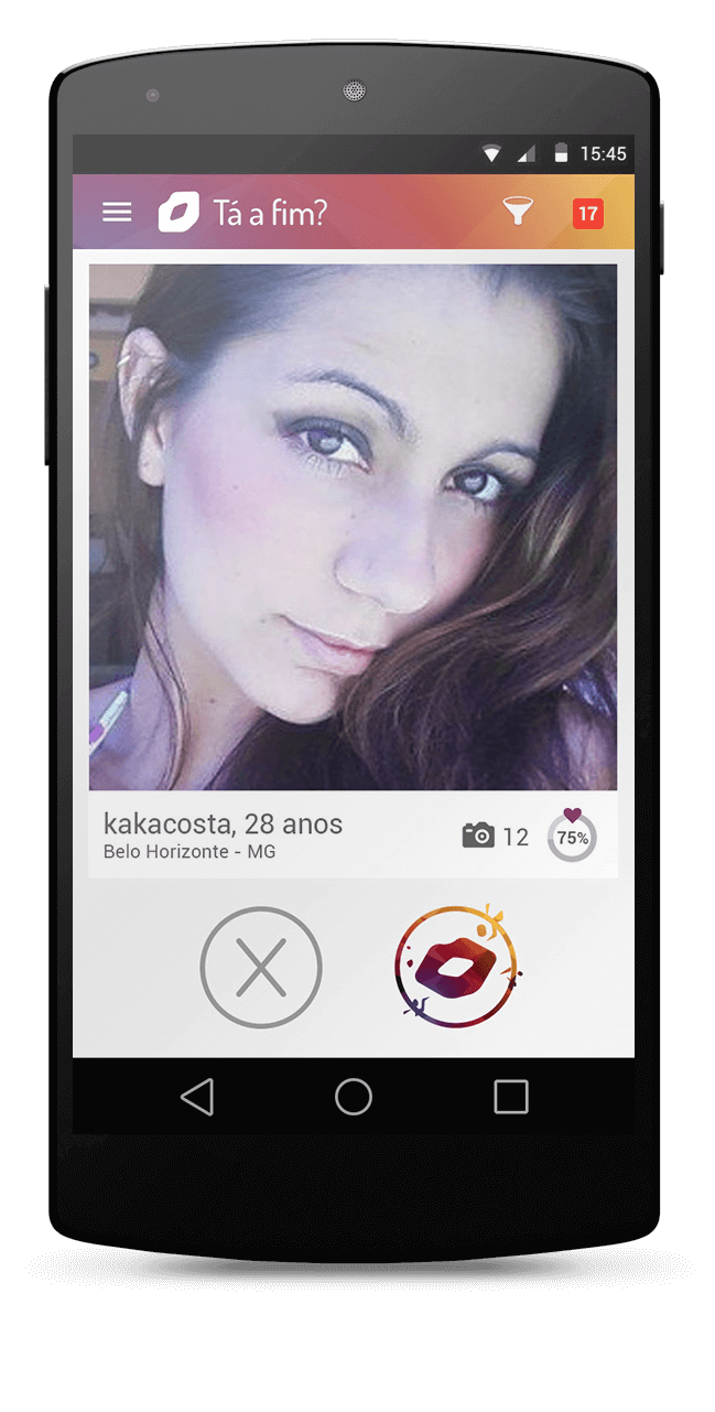
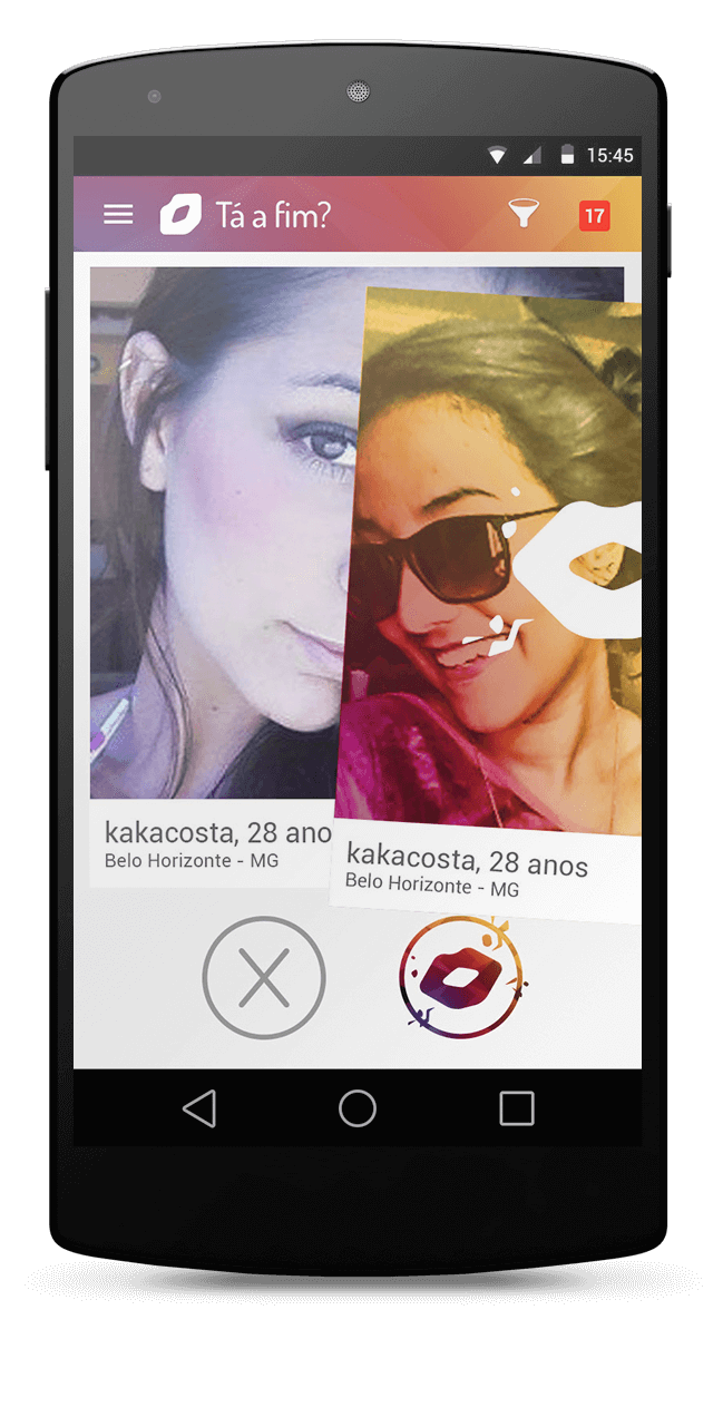
Developed at Match.com Latam, wich holds Match.com and Tinder operations in Latin America, Beija Eu app united Match and Tinder mechanics. Users registers theirs informations and start recieving match sugestions, wich they can like or dislike.
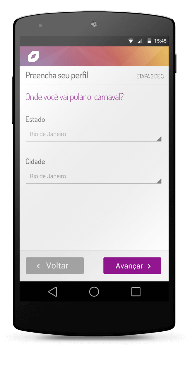
It is unique because promove dates in the happiest time of the year. The app allows the user to select the events in which he intends to be in the brazilian carnival. For this the platform was made with more than 2 thousand events in Brazil. From street parades to indoor events.
My Role
- Branding and Visual ID
- Interaction design
Goals
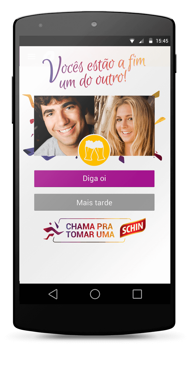
- Encourage dates between users happen in the carnival;
- Reach a great amount of qualified leads so then encourage them to sign in ParPerfeito, the biggest Match.com's product in Brazil.
Challenges
- Create a vivid key visual design wich refers to the dating and flirting idea in addition to the brazilian carnival energy, by a symbol that distinguish the app from competitors.
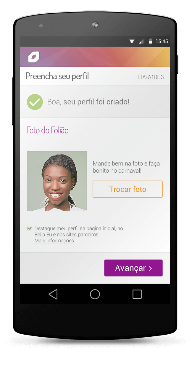
- Redesign PerPerfeito's features using these visuals.
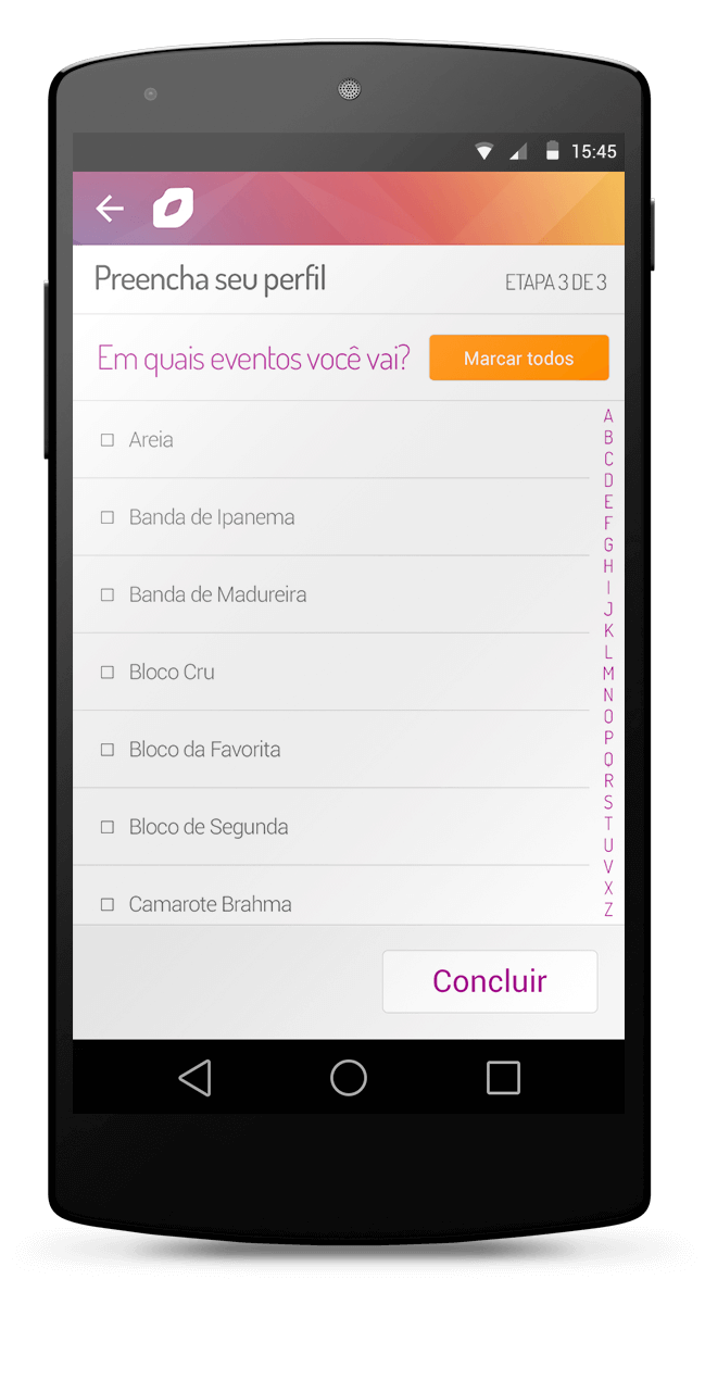
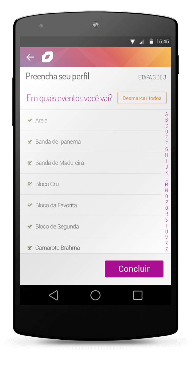
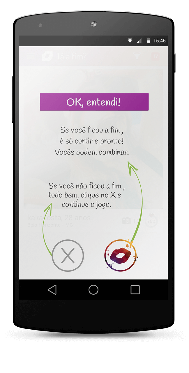
- Design an interaction that could make easy the events selection, since it was a huge list;
- Everything in very short time.
The Product
Because it was an sazonal app that demanded an very agile development, most of features was based on ParPerfeito, except by the main feature, based on Tinder.
So the design, product, marketing and programming teams got together to define, supported by a quick research with friends and family, an user persona with the most relevant traits to relie the design and development decisions on.
Persona


Was decided that we shouldn't go deeper in personas and more researches, because the deadline were close and the product lifetime was short. We prefered to look the it as a mvp so the app itself would generate data and the insights needed to next year version.
Solution
Since the idea was to use features owned by the company holding wich had already prooved themselves in the market and add them to the carnival apeal, most of the information architechture, flows and interactions was clear and define, except the events selection. So we did wireframes and userflows.
Events Picking Feature

With programming team, were defined potential partners display criteria. The software should display first those person who matches the events picking, then the ones who would be geographically near. With that idea, we designed the software tasks flow.
Potential Partners display model

With that, we ensure the biggest value proposition besides to reduce the chances of nobody being displayed.
Branding
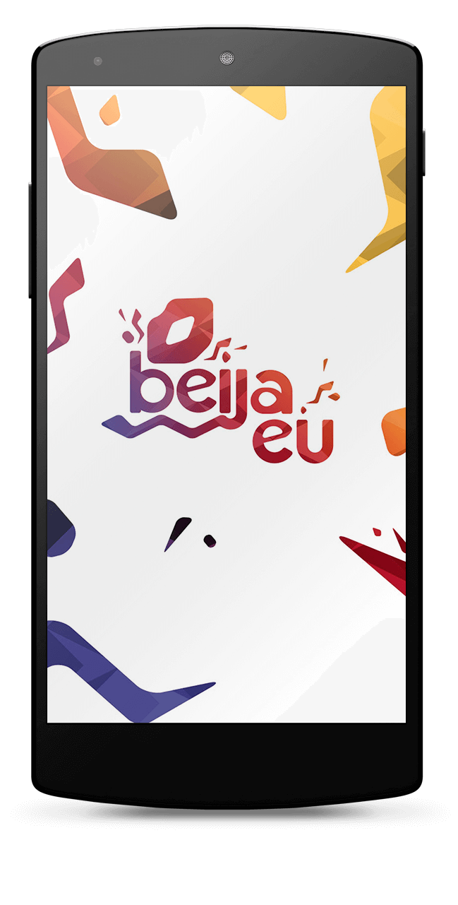
The visual identity sought to evoke sensations culturally associated to brazilian carnival like moviment, rithm, heat and mixture, at the same time refer to romance throug a symbol wich make part of collective imaginary in Brazil.
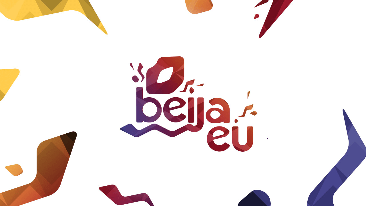
That's the reason for warm ccolors palete geometrical, but assimetric and irregular patterns, can be seen since in play store and splash screen. As well the full of moviment and expansive graphic forms and the kiss symbol.
UI

Conclusion
Beija Eu accomplished its goals resulting in a lot of leads to ParPerfeito.
This case intended to describe the design process and how my UX, interaction and UI design knowledge were applied on this app development.
Did you like? Have some suggestion of improvment? Do not hesitate![]()