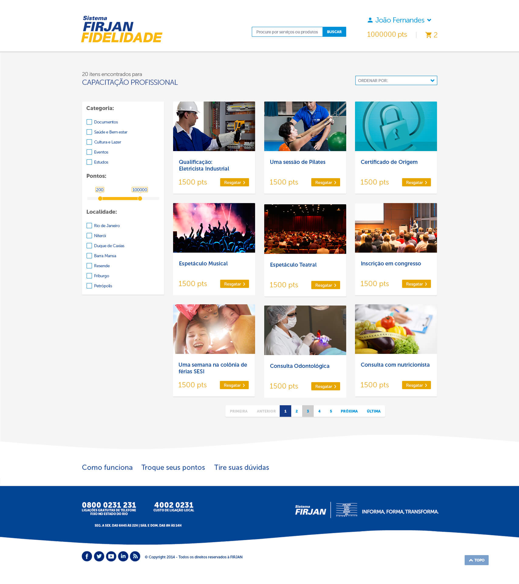
The business owners intended to launch a reward program so the could minimize the idle offer of many services and tight up bonds with his associates delivering greater value to them and his employers. I was pointed to design an interface and work together with marketing and content analysts.
My role
- Interface design
- Information architecture
Challenges
Beyond the short deadline and the huge stakeholders count, the greatest risk factors were:
- The company's service portfolio is extremely diverse, as much as its target audience;
- This make the program rules complex and hard to explain;
- We hadn't a dev team direct comunication channel, wich could lead us to serious understanding problems;
Designing
Because it was a platform based on a third party solution all the user studies has already been made. Even so, we were free to propose flows or information architecture changes. We've decided to redesign only the sign up flow, since we had 3 client segments.
The sign up proposed by platform provider was like this:

However, we felt like we needed to break into steps so we could reach signup drop-off reduction and data collect about unfinished sign ups.

In the flows wich left we focused only in information hierarchy and taxonomy. Remembering that the deadline was really short for this delivery.
To save time, I designed a styleguide based on company's branding and bootstrap framework, since we've informed that it was the front-end framework used by dev team.
The result was a great design agility, because once the components styles were defined, the UI design took short time.
Prototypes
The gratest challenges was in landing page and rules page design, cause they needed great visual appeal and lean content aproach at same time.
As the platform has a structure very similar to an e-commerce having product listing, checkout, order history, etc, designing the other screens was easier.
Conclusion
The product design was delivered in time. We keep following the development as close as we could but the company change its mind about the project so it was never launched. =(
Even so, be part of this project was a greating learning process, where I was able to find ways to go straigth the points and overcome certain diffiulties, keeping a high level of qualiy in deliverables tha was metioned as the best assets ever recieved by the third party development team.
So what do you think? Wanna talk?
Fell free


